As per usual, we ran a Foreman Community Survey in February order to give you all the opportunity to tell us how we’re doing - where it’s good, and where it’s bad. That survey closed a while ago, and I’m here to show you the results.
I’ll start in my usual manner - thanks! This survey is a beast (I know, I have to do the crunching!) and it’s not fast to fill out, so the fact that over 100 people filled it out is great. It gives us so much more confidence in the results when the sample size is good :)
As ever, this analysis is written in R and you can find the code for all of this, along with the anonymised csv data, on my GitLab mirror. Corrections / comments are welcome!
I appreciate this report is pretty long, so here’s a heads up - there’s no conclusions! The community team & I will be writing a separate post for that next week, mainly so it can get the attention it deserves. Also, if you’re short on time and want to see a specific graph, you can jump straight there using these handy links:
- A note on survey weighting
- Community and Core
- Ratings
- Deployments / Hardware
- Plugins
- Provisioning
- Proxies
- Content
- Wrap Up
A note on survey weighting…
One thing I’ve learned since last year, is that we’ve been doing surveys wrong :)
Given that the aim of a survey is to reveal insights into the whole community, it’s not sufficient to simply summarise the answers alone - doing so only tells you something about the people who responded.
As such, I’ve used a specific method to weight the survey responses so that they more accurately reflect the wider community. If you want to see the details, it’s all in Appendix 1!
Right, on with the show!
Community Metrics & Core

So here’s our first headline - no real shift in how satisfied with the project users are. That’s good news - it’s nice for that number to grow, but at 77% rating 4 or more, it’s hard to go higher :P
Because we weighted the survey using the Foreman version question, and applied the same weights to 2018, there’s no point in plotting 2018 (it’s identical to 2019 because of the weighting). However, it’s always good to see a majority of the community on supported versions.
The “community age” panel is slightly more interesting. It would seem we’re improving in recruiting new users (which was a concern last year), and the “dip” in numbers has shifted to the right into the 1-2 year groups. Let’s keep that new user growth going!
Ratings
Let’s take a look at out “Rate this out of 5” questions. Last year I did this as only 2 bars (1-3 vs 4-5) but I think it’s nice to break this out. First, the releases:

Pretty unremarkable, to be honest. A slight trend from 4 down to 3, but that could be noise, or just a sign of project growth (as we get larger, we’ll get more “middling” replies).

Again, nothing big - except the forum! There’s a large spike (nearly double!) in those who rated the forum as 5/5 for getting support - yet another vindication of my decision to migrate us all 18 months ago :)
Deployments / Hardware
First up, size of Foreman deployments - no big changes here, I think.

Looking at what OSs are used in both Foreman hosts and deployed hosts, it’s clear there’s a big jump towards RPM-based systems, at the cost of Debian, and to some extent Ubuntu. Other than that, it’s mostly noise.

Finally, hardware usage. It’s slightly tricky to compare these, as we changed the RAM question, and also add network storage as a disk option.

I think it’s clear we continue to trend towards larger-spec machines to run Foreman on - this is likely explained by an increase in Katello usage (see plugins, up next).
Overall, nothing huge here, although as a Debian user myself, the drop in Debian usage concerns me :)
Plugins
I’ve gone for a slightly different format for plugins this year:

Here we see the year-to-year growth on a single chart, rather than two separate bar charts - I think it’s clearer!
Most of these lines have a low slope (and so are likely to be just noise), but I will call out Katello, Remote Execution, and Templates as being notable. Good work!
Provisioning & Compute Resources
First up, how many people use provisioning:

We also asked about the unattended setting, which from a
development view is a major pain as it duplicates and/or
confuses many code paths in the project. We wanted to know
if we can drop it, so we asked who was using it.
The setting is only relevant to people not using provisioning (15.1%) and of those, only 22.6% are using the setting, so therefore only 3.53% of the whole community use it. That’s pretty small for the complexity it adds - I expect Tomer will want to comment on this!
We’d also like a look at Compute Resources - I’ve used the same format as plugins again to show the growth:

All fairly predictable, except for Docker dropping waaaay down.
Proxies

Nothing surprising here, really.
UI
A new section this year, so there’s no 2018 here to compare to. We started with obvious questions:

This is simple enough to interpret - most users are happy with the UI, and most think we should be streamlining and opinionating the UI.

There was also a specific question on the login screen:
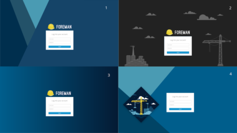 |  |
(I haven’t included a reminder for the animated one).
No overall winner, but a strong preference for screen 3 - it seems we like minimalist style here!
Content
We always include a few questions about content management, as Katello makes up such a large part of the community. Here we look at how users manage things, what they manage, and what else they’d like to manage:


There are only 2 things I think we should call out here. Firstly, Katello is now more popular than not managing content at all - nice!
Secondly, this is the first year we added Ansible to the list of “things you might like to manage in the future” (replacing Debian packages, which are now supported), and it went straight to the top spot, and by quite a margin (a 23% increase over Python). Just another example of Ansible’s popularity.
Contributing & Development
Last but not least, a look at our development community.

Firstly the basics - do people contribute, and are they aware of ways in which they can get help / participate. The notable changes here for me are (a) less people in the “Would like to contribute” section (sadface!) and the much smaller percentage of users who aren’t aware of any of our development resources (down by 67%).

This is the important one - where do people want to contribute? Last year we didn’t ask this in enough detail, so this is only the 2019 data here. Note that for this question, I included “No answer” as “No interest in contributing”, instead of dropping that row, as I think it’s a fairer view.
I think Bugs & Triage is in a good state, but note how in every other category there are more people who want to help than those who currently help. That tells us a lot about things we might need to focus on.

And finally, the development support ratings. Nothing shocking here, we again see the drift towards 3/5 from 5/5, which as before speaks more about the growth of the community than anything else.
Wrap Up
As I said at the start, the conclusions and future plans will have to wait for a second blog post, as this one is long enough already! Look out for that soon, and for now thanks for reading!
As ever, if you have comments or questions, hit me up in the comments below and I’ll be happy to discuss.
Appendix 1 - Survey Weighting
OK, you want the gory details? Let’s rock….
So ideally, when you collect a survey, you want to generalise the answers to the whole community - but crucially, you need to weight it. To do that, you need to ask one question (or more) that you already have an answer to. Happily, we do have that, in the form of the Foreman Version question.
Consider these two graphs:

On the left is the unweighted survey data for the question “What version of Foreman are you running?”. On the right is the data we have from the RSS feed, which can tell us something about the versions of Foreman in use from the widget on the Foreman dashboard.
You’ll notice they are not the same. It seems that survey responses are more likely to be running the latest of Foreman than the wider community. That makes some sense (active users are more likely to upgrade, and also more likely to know about the survey), but it means that users of older versions are under-represented in the survey.
To fix this, we can calculate a set of weights which are
applied to each row of the CSV (you can find these in the
wt column in the anonymised data). This is essentially a
number which says “How many users does this response to the
survey represent?”
IMPORTANT caveat: We have no such RSS data for 2018 (the widget only arrived in 1.17), so I have applied the same weight structure to the 2018 data. This means we’re less certain about our numbers for 2018, but it’s better than comparing weighted with unweighted data…
OK, get back to the proper report now :)